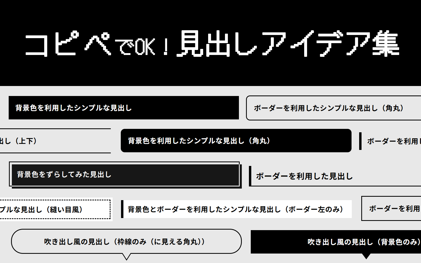
HTMLとCSSコピペで作れる!見出しアイデア集
公開:2025.11.30 更新:2025.12.07
HTMLとCSSで作る見出しのアイデア集です。
コピペですぐ作れるようにまとめています。
基本のコード
このページで作成している見出しの、基本のコードがこちらです。
今回はpタグで作成していますが、必要に応じてh1やh2などに変更してください。
※CSSでrem指定しているところは、使用する人の環境によって数値が変わりますのでご注意ください。
※このwebサイトでは、1rem=10pxくらいのサイズになります。
特に装飾がなくても、フォントサイズを大きくしたり、フォントの太さを変えるだけでも見出しとして機能します。
以下、このコードをベースにしてカスタマイズしていきます。
基本のコードで出力した見出し
<p class="heading-ttl">基本のコードで出力した見出し</p>.heading-ttl {
line-height: 1.5;
font-size: 1.8rem;
font-weight: 700;
margin-bottom: 0;
}シンプルな見出し
背景色やボーダーで作る、シンプルな見出しです。
背景色を利用した見出し
単に背景色を変更するだけでも見出しに利用できます。
グラデーションの見出しも作ってみましたが、読みづらさが勝ったのでイマイチおすすめできないですね。
orz
背景色を利用したシンプルな見出し
<p class="heading-ttl heading-ttl-simple-bc">背景色を利用したシンプルな見出し</p>.heading-ttl {
line-height: 1.5;
font-size: 1.8rem;
font-weight: 700;
margin-bottom: 0;
}
.heading-ttl.heading-ttl-simple-bc {
background-color: #000000;
color: #fff;
padding: 0.9em 1em;
}背景色を利用したシンプルな見出し(角丸)
<p class="heading-ttl heading-ttl-simple-bc-radius">背景色を利用したシンプルな見出し</p>.heading-ttl {
line-height: 1.5;
font-size: 1.8rem;
font-weight: 700;
margin-bottom: 0;
}
.heading-ttl.heading-ttl-simple-bc-radius {
background-color: #000000;
color: #fff;
padding: 0.9em 1em;
border-radius: 1rem;
}背景色を利用したシンプルな見出し(グラデーション※読みづらい)
<p class="heading-ttl heading-ttl-simple-bc-gradation">背景色を利用したシンプルな見出し(グラデーション※読みづらい)</p>.heading-ttl {
line-height: 1.5;
font-size: 1.8rem;
font-weight: 700;
margin-bottom: 0;
}
.heading-ttl.heading-ttl-simple-bc-gradation {
background: linear-gradient(90deg, rgb(0, 0, 0), rgba(0, 0, 0, 0));
padding: 0.9em 1em;
color: #fff;
}ボーダーを利用した見出し
単にボーダーでタイトルを囲ってみるとか、上下にラインを引いてみるだけでも良きです。
ちなみに次のようなコードで、このページで使用しているh3タグと同じようなものが作成できます。
<p class="heading-ttl heading-ttl-simple-bd-left6-bottom2">ボーダーを利用したシンプルな見出し(左に6px、下に2px)</p>.heading-ttl {
line-height: 1.5;
font-size: 1.8rem;
font-weight: 700;
margin-bottom: 0;
}
.heading-ttl.heading-ttl-simple-bd-left6-bottom2 {
border-left: 6px #000000 solid;
border-bottom: 2px #000000 solid;
padding: 0.5em 0.6em;
}ボーダーを利用したシンプルな見出し
<p class="heading-ttl heading-ttl-simple-bd">ボーダーを利用したシンプルな見出し</p>.heading-ttl {
line-height: 1.5;
font-size: 1.8rem;
font-weight: 700;
margin-bottom: 0;
}
.heading-ttl.heading-ttl-simple-bd {
border: 2px #000000 solid;
padding: 0.9em 1em;
}ボーダーを利用したシンプルな見出し(角丸)
<p class="heading-ttl heading-ttl-simple-bd-radius">ボーダーを利用したシンプルな見出し(角丸)</p>.heading-ttl {
line-height: 1.5;
font-size: 1.8rem;
font-weight: 700;
margin-bottom: 0;
}
.heading-ttl.heading-ttl-simple-bd-radius {
border: 2px #000000 solid;
padding: 0.9em 1em;
border-radius: 1rem;
}ボーダーを利用したシンプルな見出し(上下)
<p class="heading-ttl heading-ttl-simple-bd-top-bottom">ボーダーを利用したシンプルな見出し(上下)</p>.heading-ttl {
line-height: 1.5;
font-size: 1.8rem;
font-weight: 700;
margin-bottom: 0;
}
.heading-ttl.heading-ttl-simple-bd-top-bottom {
border-top: 2px #000000 solid;
border-bottom: 2px #000000 solid;
padding: 0.9em 1em;
}ボーダーを利用したシンプルな見出し(左)
<p class="heading-ttl heading-ttl-simple-bd-left">ボーダーを利用したシンプルな見出し(左)</p>.heading-ttl {
line-height: 1.5;
font-size: 1.8rem;
font-weight: 700;
margin-bottom: 0;
}
.heading-ttl.heading-ttl-simple-bd-left {
border-left: 6px #000000 solid;
padding-top: 0.5em;
padding-bottom: 0.5em;
padding-left: 0.8em;
}背景色とボーダーを利用した見出し
背景色だけでなく、ボーダーも組み合わせた見出しです。
ボーダーの太さやスタイルを変えてみるだけでも結構印象が変わります。
ちなみに、次のようなコードでこのページで使用しているh2タグと同じようなものが作成できます。
<p class="heading-ttl heading-ttl-simple-bc-bd-left6">背景色とボーダーを利用したシンプルな見出し</p>.heading-ttl {
line-height: 1.5;
font-size: 1.8rem;
font-weight: 700;
margin-bottom: 0;
}
.heading-ttl.heading-ttl-simple-bc-bd-left6 {
background: #fff;
border: 2px solid #000000;
border-left-width: 6px;
padding: 0.9em 0.8em;
}背景色とボーダーを利用したシンプルな見出し(ボーダー左のみ)
<p class="heading-ttl heading-ttl-simple-bc-bd-left">背景色とボーダーを利用したシンプルな見出し(ボーダー左のみ)</p>.heading-ttl {
line-height: 1.5;
font-size: 1.8rem;
font-weight: 700;
margin-bottom: 0;
}
.heading-ttl.heading-ttl-simple-bc-bd-left {
background: #fff;
border-left: 6px solid #000000;
padding: 0.9em 0.8em;
}背景色とボーダーを利用したシンプルな見出し(縫い目風)
<p class="heading-ttl heading-ttl-simple-bc-bd-stitch"><span>背景色とボーダーを利用したシンプルな見出し(縫い目風)</span></p>.heading-ttl {
line-height: 1.5;
font-size: 1.8rem;
font-weight: 700;
margin-bottom: 0;
}
.heading-ttl.heading-ttl-simple-bc-bd-stitch {
background: #fff;
padding: 0.3em;
color: #000000;
}
.heading-ttl.heading-ttl-simple-bc-bd-stitch span {
display: block;
border: 2px dashed #000000;
padding: 0.9em 0.8em;
}擬似要素を利用した見出し
ここからは擬似要素(::before・::after)を利用した見出しになります。
背景色をずらしてみる
擬似要素を背景色として利用し、少しずらしてみました。
作成した擬似要素に「mix-blend-mode: difference;」を指定することで、被った部分の色が変わります。
ただし、この色変更は擬似要素の色や、擬似要素と被った位置にある要素の色によって全然違う色になってしまうので注意が必要です。
背景色をずらしてみた見出し
<p class="heading-ttl heading-ttl-bf-shift">背景色をずらしてみた見出し</p>.heading-ttl {
line-height: 1.5;
font-size: 1.8rem;
font-weight: 700;
margin-bottom: 0;
}
.heading-ttl.heading-ttl-bf-shift {
border: 2px #000000 solid;
padding: 0.9em 1em;
position: relative;
}
.heading-ttl.heading-ttl-bf-shift::before {
content: " ";
display: block;
background-color: #fff;
position: absolute;
top: 0.3em;
left: 0.3em;
width: calc(100% + 2px);
height: calc(100% + 2px);
mix-blend-mode: difference;
}吹き出し風の見出し
擬似要素で吹き出しっぽくした見出しです。
背景色のみ・枠線のみ(に見える)・背景色のみと枠線のみ(に見える)の角丸バージョンをそれぞれ作成してみました。
吹き出し風の見出し(背景色のみ)
吹き出し風の見出し(背景色のみ角丸)
<p class="heading-ttl heading-ttl-bf-bc-speechbubble">吹き出し風の見出し(背景色のみ)</p>
<p class="heading-ttl heading-ttl-bf-bc-speechbubble heading-ttl-bf-bc-speechbubble-radius">吹き出し風の見出し(背景色のみ角丸)</p>.heading-ttl {
line-height: 1.5;
font-size: 1.8rem;
font-weight: 700;
margin-bottom: 0;
}
.heading-ttl.heading-ttl-bf-bc-speechbubble {
background-color: #000000;
color: #fff;
padding: 0.9em 1em;
position: relative;
margin-bottom: 1.6rem;
text-align: center;
}
.heading-ttl.heading-ttl-bf-bc-speechbubble::before {
content: " ";
display: block;
position: absolute;
border-top: 1.6rem #000000 solid;
border-left: 1.2rem rgba(0, 0, 0, 0) solid;
border-right: 1.2rem rgba(0, 0, 0, 0) solid;
bottom: -1.5rem;
left: calc(50% - 1.2rem);
}
/* 角丸にする場合追加 */
.heading-ttl.heading-ttl-bf-bc-speechbubble.heading-ttl-bf-bc-speechbubble-radius {
border-radius: 3rem;
}吹き出し風の見出し(枠線のみ(に見える))
吹き出し風の見出し(枠線のみ(に見える角丸))
<p class="heading-ttl heading-ttl-bf-bc-bd-speechbubble">吹き出し風の見出し(枠線のみ(に見える))</p>
<p class="heading-ttl heading-ttl-bf-bc-bd-speechbubble heading-ttl-bf-bc-bd-speechbubble-radius">吹き出し風の見出し(枠線のみ(に見える角丸))</p>.heading-ttl {
line-height: 1.5;
font-size: 1.8rem;
font-weight: 700;
margin-bottom: 0;
}
.heading-ttl.heading-ttl-bf-bc-bd-speechbubble {
background-color: #e8e8e8; /* 背景色に合わせる */
border: 2px #000000 solid;
padding: 0.9em 1em;
position: relative;
margin-bottom: 1.9rem;
text-align: center;
}
.heading-ttl.heading-ttl-bf-bc-bd-speechbubble::before {
content: " ";
display: block;
position: absolute;
border-top: 1.9rem #000000 solid; /* ボーダーの色に合わせる */
border-left: 1.2rem rgba(0, 0, 0, 0) solid;
border-right: 1.2rem rgba(0, 0, 0, 0) solid;
bottom: -1.9rem;
left: calc(50% - 1.2rem);
}
.heading-ttl.heading-ttl-bf-bc-bd-speechbubble::after {
content: " ";
display: block;
position: absolute;
border-top: 1.9rem #e8e8e8 solid; /* 背景色に合わせる */
border-left: 1.2rem rgba(0, 0, 0, 0) solid;
border-right: 1.2rem rgba(0, 0, 0, 0) solid;
bottom: -1.6rem;
left: calc(50% - 1.2rem);
}
/* 角丸にする場合追加 */
.heading-ttl.heading-ttl-bf-bc-bd-speechbubble.heading-ttl-bf-bc-bd-speechbubble-radius {
border-radius: 3rem;
}背景色+左端に角丸の擬似要素
擬似要素を角丸にして左端に配置した+背景色を合わせた見出しです。
背景色+左に角丸擬似要素
<p class="heading-ttl heading-ttl-bf-left-bc">背景色+左に角丸擬似要素</p>.heading-ttl {
line-height: 1.5;
font-size: 1.8rem;
font-weight: 700;
margin-bottom: 0;
}
.heading-ttl.heading-ttl-bf-left-bc {
background-color: #fff;
position: relative;
padding: 0.9em calc(0.9em + 6px);
border-radius: 3px;
}
.heading-ttl.heading-ttl-bf-left-bc::before {
content: " ";
display: block;
position: absolute;
width: 6px;
height: calc(100% - 0.9em);
top: 0.45em;
left: 0.45em;
background-color: #000000;
border-radius: 3px;
}斜め線の擬似要素を利用してみる①
擬似要素で斜めの線を作成した見出しです。
まずは同じ角度で斜めにした線を2本使ったタイプを作ってみました。
これはテキストが長すぎて改行してしまうと、少し微妙かもしれません…。
同じ角度で斜めにした線を2本使ったタイプ
<div style="text-align: center;">
	<p class="heading-ttl heading-ttl-bf-diagonal-same">同じ角度で斜めにした線を2本使ったタイプ</p>
</div>.heading-ttl {
line-height: 1.5;
font-size: 1.8rem;
font-weight: 700;
margin-bottom: 0;
}
.heading-ttl.heading-ttl-bf-diagonal-same {
display: inline-block;
padding-right: 1.2em;
padding-left: 1.2em;
position: relative;
}
.heading-ttl.heading-ttl-bf-diagonal-same::before, .heading-ttl.heading-ttl-bf-diagonal-same::after {
content: " ";
width: 2px;
height: 120%;
display: block;
background-color: #000000;
-webkit-transform: rotate(30deg);
transform: rotate(30deg);
position: absolute;
top: -10%;
}
.heading-ttl.heading-ttl-bf-diagonal-same::before {
left: 0;
}
.heading-ttl.heading-ttl-bf-diagonal-same::after {
right: 0;
}斜め線の擬似要素を利用してみる②
先ほどの①見出しの左側の擬似要素の角度を変更してみました。
なんだか元気そうな雰囲気になります。
片方違う角度で斜めにした線を2本使ったタイプ
<div style="text-align: center;">
	<p class="heading-ttl heading-ttl-bf-diagonal-different">片方違う角度で斜めにした線を2本使ったタイプ</p>
</div>.heading-ttl {
line-height: 1.5;
font-size: 1.8rem;
font-weight: 700;
margin-bottom: 0;
}
.heading-ttl.heading-ttl-bf-diagonal-different {
display: inline-block;
padding-right: 1em;
padding-left: 1em;
position: relative;
}
.heading-ttl.heading-ttl-bf-diagonal-different::before, .heading-ttl.heading-ttl-bf-diagonal-different::after {
content: " ";
width: 2px;
height: 120%;
display: block;
background-color: #000000;
position: absolute;
top: -10%;
}
.heading-ttl.heading-ttl-bf-diagonal-different::before {
left: 4px;
-webkit-transform: rotate(-30deg);
transform: rotate(-30deg);
}
.heading-ttl.heading-ttl-bf-diagonal-different::after {
right: 4px;
-webkit-transform: rotate(30deg);
transform: rotate(30deg);
}斜め線の擬似要素を利用してみる③
さっきの②見出しに線を2本増やしたバージョンです。
「span」で囲んで擬似要素を増やしました。
片方違う角度で斜めにした線を4本使ったタイプ
<div style="text-align: center;">
	<p class="heading-ttl heading-ttl-bf-diagonal-different"><span>片方違う角度で斜めにした線を4本使ったタイプ</span></p>
</div>.heading-ttl {
line-height: 1.5;
font-size: 1.8rem;
font-weight: 700;
margin-bottom: 0;
}
.heading-ttl.heading-ttl-bf-.heading-ttl.heading-ttl-bf-diagonal-different {
display: inline-block;
padding-right: 1em;
padding-left: 1em;
position: relative;
}
.heading-ttl.heading-ttl-bf-diagonal-different::before, .heading-ttl.heading-ttl-bf-diagonal-different::after {
content: " ";
width: 2px;
height: 120%;
display: block;
background-color: #000000;
position: absolute;
bottom: -10%;
}
.heading-ttl.heading-ttl-bf-diagonal-different::before {
left: 4px;
-webkit-transform: rotate(-30deg);
transform: rotate(-30deg);
}
.heading-ttl.heading-ttl-bf-diagonal-different::after {
right: 4px;
-webkit-transform: rotate(30deg);
transform: rotate(30deg);
}
.heading-ttl.heading-ttl-bf-diagonal-different span {
display: inline-block;
}
.heading-ttl.heading-ttl-bf-diagonal-different span::before, .heading-ttl.heading-ttl-bf-diagonal-different span::after {
content: " ";
width: 2px;
height: 100%;
display: block;
background-color: #000000;
position: absolute;
bottom: -15%;
}
.heading-ttl.heading-ttl-bf-diagonal-different span::before {
left: 0;
-webkit-transform: rotate(-35deg);
transform: rotate(-35deg);
}
.heading-ttl.heading-ttl-bf-diagonal-different span::after {
right: 0;
-webkit-transform: rotate(35deg);
transform: rotate(35deg);
}元気そうな見出し①
擬似要素で細長三角形を2つ作って左右に配置しました。
この擬似要素は高さを指定しているので、テキストはできるだけ1行に収めたほうがいいと思います。
なんだか元気そうなやつ
<div style="text-align: center;">
	<p class="heading-ttl heading-ttl-bf-fine">なんだか元気そうなやつ</p>
</div>.heading-ttl {
line-height: 1.5;
font-size: 1.8rem;
font-weight: 700;
margin-bottom: 0;
}
.heading-ttl.heading-ttl-bf-fine {
display: inline-block;
padding-right: 1.8em;
padding-left: 1.8em;
position: relative;
}
.heading-ttl.heading-ttl-bf-fine::before, .heading-ttl.heading-ttl-bf-fine::after {
content: " ";
border-top: 2em #000000 solid;
border-right: 0.2em rgba(0, 0, 0, 0) solid;
border-left: 0.2em rgba(0, 0, 0, 0) solid;
display: block;
position: absolute;
bottom: -0.4em;
}
.heading-ttl.heading-ttl-bf-fine::before {
left: 0.8em;
-webkit-transform: rotate(-30deg);
transform: rotate(-30deg);
}
.heading-ttl.heading-ttl-bf-fine::after {
right: 0.8em;
-webkit-transform: rotate(30deg);
transform: rotate(30deg);
}元気そうな見出し②
先ほどの見出しに擬似要素を2つ増やしました。
より元気そうです。
なんだか元気そうなやつ
<div style="text-align: center;">
	<p class="heading-ttl heading-ttl-bf-fine"><span>なんだか元気そうなやつ</span></p>
</div>.heading-ttl {
line-height: 1.5;
font-size: 1.8rem;
font-weight: 700;
margin-bottom: 0;
}
.heading-ttl.heading-ttl-bf-fine {
display: inline-block;
padding-right: 1.8em;
padding-left: 1.8em;
position: relative;
}
.heading-ttl.heading-ttl-bf-fine::before, .heading-ttl.heading-ttl-bf-fine::after {
content: " ";
border-top: 2em #000000 solid;
border-right: 0.2em rgba(0, 0, 0, 0) solid;
border-left: 0.2em rgba(0, 0, 0, 0) solid;
display: block;
position: absolute;
bottom: -0.4em;
}
.heading-ttl.heading-ttl-bf-fine::before {
left: 0.8em;
-webkit-transform: rotate(-30deg);
transform: rotate(-30deg);
}
.heading-ttl.heading-ttl-bf-fine::after {
right: 0.8em;
-webkit-transform: rotate(30deg);
transform: rotate(30deg);
}
.heading-ttl.heading-ttl-bf-fine span {
display: inline-block;
}
.heading-ttl.heading-ttl-bf-fine span::before, .heading-ttl.heading-ttl-bf-fine span::after {
content: " ";
border-top: 1.6em #000000 solid;
border-right: 0.15em rgba(0, 0, 0, 0) solid;
border-left: 0.15em rgba(0, 0, 0, 0) solid;
display: block;
position: absolute;
bottom: -0.6em;
}
.heading-ttl.heading-ttl-bf-fine span::before {
left: 0.6em;
-webkit-transform: rotate(-45deg);
transform: rotate(-45deg);
}
.heading-ttl.heading-ttl-bf-fine span::after {
right: 0.6em;
-webkit-transform: rotate(45deg);
transform: rotate(45deg);
}かぎかっこ風の見出し
四角形の擬似要素を二つ作成して、「」のような状態にします。
かぎかっこっぽい
<div style="text-align: center;">
	<p class="heading-ttl heading-ttl-bf-square-brackets">かぎかっこっぽい</p>
</div>.heading-ttl {
line-height: 1.5;
font-size: 1.8rem;
font-weight: 700;
margin-bottom: 0;
}
.heading-ttl.heading-ttl-bf-square-brackets {
display: inline-block;
padding: 1em;
position: relative;
}
.heading-ttl.heading-ttl-bf-square-brackets::before, .heading-ttl.heading-ttl-bf-square-brackets::after {
content: " ";
display: block;
position: absolute;
width: 0.5em;
height: 0.5em;
}
.heading-ttl.heading-ttl-bf-square-brackets::before {
border-top: 2px #000000 solid;
border-left: 2px #000000 solid;
top: 0;
left: 0;
}
.heading-ttl.heading-ttl-bf-square-brackets::before {
border-bottom: 2px #000000 solid;
border-right: 2px #000000 solid;
bottom: 0;
right: 0;
}かぎかっこ風の見出し?
さっきのやつの右上と左下に擬似要素を増やしました。
かぎかっこっぽい?
<div style="text-align: center;">
	<p class="heading-ttl heading-ttl-bf-square-brackets"><span>かぎかっこっぽい?</span></p>
</div>.heading-ttl {
line-height: 1.5;
font-size: 1.8rem;
font-weight: 700;
margin-bottom: 0;
}
.heading-ttl.heading-ttl-bf-square-brackets {
display: inline-block;
padding: 1em;
position: relative;
}
.heading-ttl.heading-ttl-bf-square-brackets::before, .heading-ttl.heading-ttl-bf-square-brackets::after {
content: " ";
display: block;
position: absolute;
width: 0.5em;
height: 0.5em;
}
.heading-ttl.heading-ttl-bf-square-brackets::before {
border-top: 2px #000000 solid;
border-left: 2px #000000 solid;
top: 0;
left: 0;
}
.heading-ttl.heading-ttl-bf-square-brackets::before {
border-bottom: 2px #000000 solid;
border-right: 2px #000000 solid;
bottom: 0;
right: 0;
}
.heading-ttl.heading-ttl-bf-square-brackets span::before, .heading-ttl.heading-ttl-bf-square-brackets span::after {
content: " ";
display: block;
position: absolute;
width: 1em;
height: 1em;
}
.heading-ttl.heading-ttl-bf-square-brackets span::before {
border-top: 2px #000000 solid;
border-right: 2px #000000 solid;
top: 0;
right: 0;
}
.heading-ttl.heading-ttl-bf-square-brackets span::after {
border-bottom: 2px #000000 solid;
border-left: 2px #000000 solid;
bottom: 0;
left: 0;
}短めの横線を左下に配置してみる
afterで短めの横線を配置してみました。
この擬似要素は「position:absolute」は指定せずに、marginで位置を調整しています。
短めの横線を下に配置(左寄せ)
<p class="heading-ttl heading-ttl-bf-short-horizontal-line">短めの横線を下に配置(左寄せ)</p>.heading-ttl {
line-height: 1.5;
font-size: 1.8rem;
font-weight: 700;
margin-bottom: 0;
}
.heading-ttl.heading-ttl-bf-short-horizontal-line::after {
content: " ";
display: block;
background-color: #000000;
width: 4em;
height: 2px;
margin-top: 0.8em;
}短めの横線を真ん中下に配置してみる
短めの横線を下に配置(真ん中寄せ)
<div style="text-align: center;">
	<p class="heading-ttl heading-ttl-bf-short-horizontal-line htb-shl-center">短めの横線を下に配置(真ん中寄せ)</p>
</div>.heading-ttl {
line-height: 1.5;
font-size: 1.8rem;
font-weight: 700;
margin-bottom: 0;
}
.heading-ttl.heading-ttl-bf-short-horizontal-line::after {
content: " ";
display: block;
background-color: #000000;
width: 4em;
height: 2px;
margin-top: 0.8em;
}
.heading-ttl.heading-ttl-bf-short-horizontal-line.htb-shl-center::after {
margin-right: auto;
margin-left: auto;
}以上、見出しアイデア集でした!
とりあえず思いついたものをいくつか作ってみました。
ページの要所要所に目を引く見出しがあると、それだけでページがバシッと決まることもあるので、作成しているホームページに合わせて色々試作してみるのもいいかもですね。
このWEBサイトがモノクロメインで作っているので、基本白黒でつくりました。
作成しているホームページの雰囲気によって色を変えるだけでも印象がかなり変わりますので、ぜひお試しあれ~。
気が向いたらまた増やすかもしれません。