チャット風デザインのHTML&CSS
公開:2026.02.12
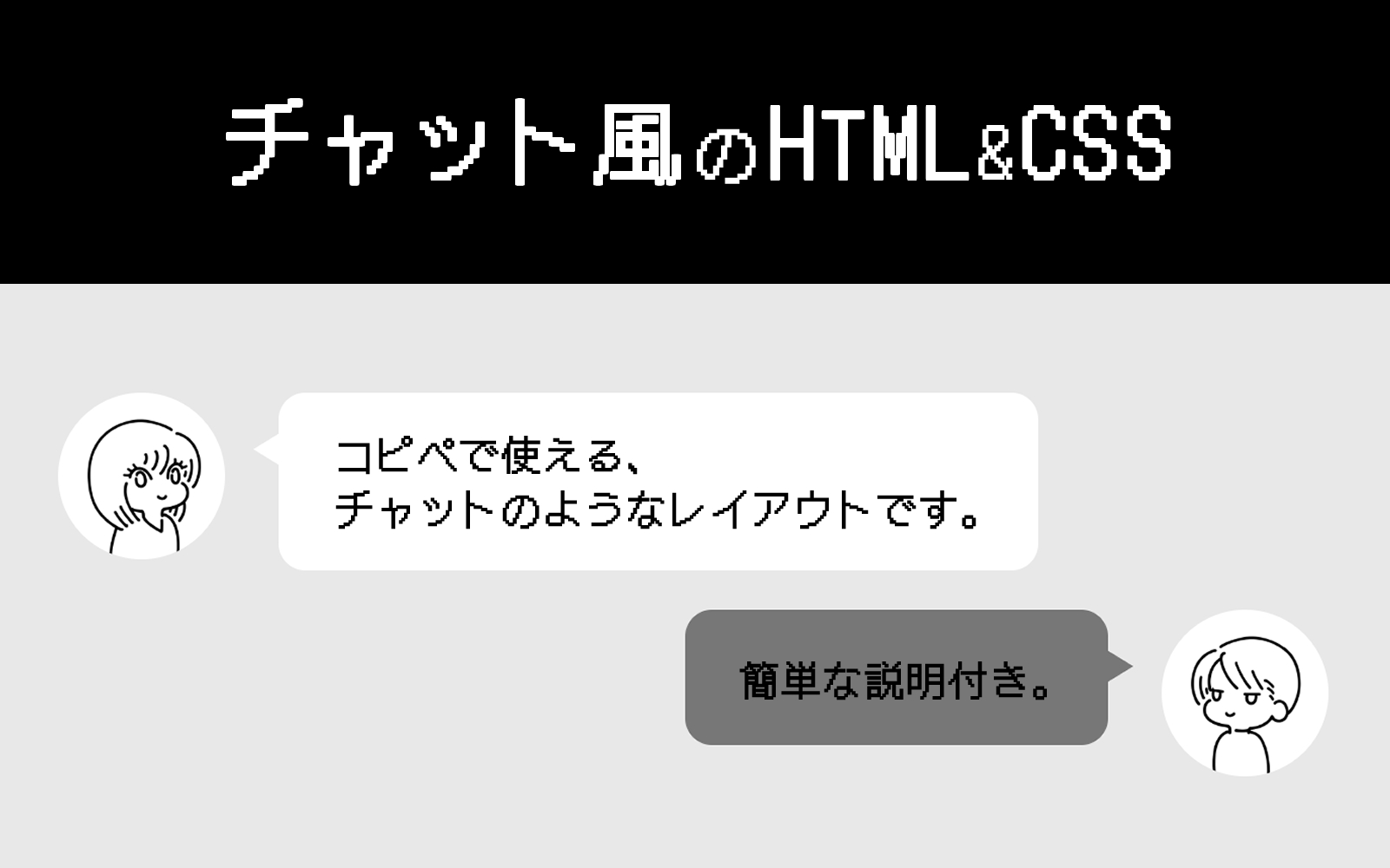
今回はチャット風のデザインをHTMLとCSSでコーディングしてみたいと思います。
LINEのトーク画面をイメージしてもらうとわかりやすいかもしれません。
コピペで次のようなチャット風レイアウトを作れます。
ここに文章が入ります。
これは左側に表示されます。
こっちは右側に表示されます。
アイコン用の画像のサイズですが、今回の場合は正方形がオススメです。
今回はスマートフォン版のサイズ調整をしていないため、ご自分の環境に合わせてカスタマイズしてください。
コピペ用のHTMLとCSSはこちらです。
誰かの会話形式で進めていく記事などで使えると思います。
では、こちらのHTMLとCSSについて簡単に説明していきます。
※CSSでrem指定しているところは、使用する人の環境によって数値が変わりますのでご注意ください。
※このwebサイトでは、1rem=10pxくらいのサイズになります。
<div class="chat-style-wrap chat-style-left">
	<div class="chat-style-icon">
		<div class="chat-style-icon-inner">
			<img src="ここに画像パスをいれてください" alt="" width="" height="">
		</div>
	</div>
	<div class="chat-style-speech-bubble">
		<p class="chat-style-speech-bubble-txt">ここに文章が入ります。<br>これは左側に表示されます。</p>
	</div>
</div>
<div class="chat-style-wrap chat-style-right">
	<div class="chat-style-icon">
		<div class="chat-style-icon-inner">
			<img src="ここに画像パスをいれてください" alt="" width="" height="">
		</div>
	</div>
	<div class="chat-style-speech-bubble">
		<p class="chat-style-speech-bubble-txt">こっちは右側に表示されます。<br>アイコン用の画像のサイズですが、今回の場合は正方形がオススメです。</p>
	</div>
</div>
<div class="chat-style-wrap chat-style-right">
	<div class="chat-style-icon">
		<div class="chat-style-icon-inner">
			<img src="ここに画像パスをいれてください" alt="" width="" height="">
		</div>
	</div>
	<div class="chat-style-speech-bubble">
		<p class="chat-style-speech-bubble-txt">今回はスマートフォン版のサイズ調整をしていないため、ご自分の環境に合わせてカスタマイズしてください。</p>
	</div>
</div>.chat-style-wrap {
display: flex;
align-items: flex-start;
margin-bottom: 2.4rem;
}
.chat-style-wrap .chat-style-icon {
width: 10rem;
}
.chat-style-wrap .chat-style-icon .chat-style-icon-inner {
height: 10rem;
width: 100%;
border-radius: 50%;
overflow: hidden;
}
.chat-style-wrap .chat-style-icon .chat-style-icon-inner img {
max-width: 100%;
height: auto;
}
.chat-style-wrap .chat-style-speech-bubble {
max-width: calc(100% - 10rem - 3.2rem);
border-radius: 1.6rem;
position: relative;
padding: 2.8rem 3.2rem;
display: inline-block;
}
.chat-style-wrap .chat-style-speech-bubble::before {
content: " ";
border-top: rgba(0, 0, 0, 0) solid 1rem;
border-bottom: rgba(0, 0, 0, 0) solid 1rem;
position: absolute;
top: 2.4rem;
}
.chat-style-wrap .chat-style-speech-bubble .chat-style-speech-bubble-txt {
margin-bottom: 0;
}
.chat-style-wrap.chat-style-left .chat-style-speech-bubble {
margin-left: 3.2rem;
background-color: #fff;
}
.chat-style-wrap.chat-style-left .chat-style-speech-bubble::before {
left: -1.5rem;
border-right: 1.6rem solid #fff;
}
.chat-style-wrap.chat-style-right {
justify-content: flex-end;
}
.chat-style-wrap.chat-style-right .chat-style-icon {
order: 2;
}
.chat-style-wrap.chat-style-right .chat-style-speech-bubble {
margin-right: 3.2rem;
background-color: #777;
order: 1;
}
.chat-style-wrap.chat-style-right .chat-style-speech-bubble::before {
right: -1.5rem;
border-left: 1.6rem solid #777;
}HTMLの説明
左に表示している方も右に表示している方も、同じ構成になっています。
「chat-style-wrap」の中にアイコン画像と吹き出しのブロックがあり、それを横並びにしています。
それぞれ「chat-style-left」「chat-style-right」という左用・右用の設定をするクラスをつけて、CSSで表示を切り替えました。
<!--左-->
<div class="chat-style-wrap chat-style-left">
	<div class="chat-style-icon">
		<div class="chat-style-icon-inner">
			<img src="ここに画像パスをいれてください" alt="" width="" height="">
		</div>
	</div>
	<div class="chat-style-speech-bubble">
		<p class="chat-style-speech-bubble-txt">ここに文章が入ります。<br>これは左側に表示されます。</p>
	</div>
</div>

<!--右-->
<div class="chat-style-wrap chat-style-right">
	<div class="chat-style-icon">
		<div class="chat-style-icon-inner">
			<img src="ここに画像パスをいれてください" alt="" width="" height="">
		</div>
	</div>
	<div class="chat-style-speech-bubble">
		<p class="chat-style-speech-bubble-txt">こっちは右側に表示されます。<br>アイコン用の画像のサイズですが、今回の場合は正方形がオススメです。</p>
	</div>
</div>CSSの説明
今回は基本の設定と、左右それぞれの設定をしています。
基本の設定
.chat-style-wrap {
  display: flex;
  align-items: flex-start;
  margin-bottom: 2.4rem;
}
.chat-style-wrap .chat-style-icon {
  width: 10rem;
}
.chat-style-wrap .chat-style-icon .chat-style-icon-inner {
  height: 10rem;
  width: 100%;
  border-radius: 50%;
  overflow: hidden;
}
.chat-style-wrap .chat-style-icon .chat-style-icon-inner img {
  max-width: 100%;
  height: auto;
}
.chat-style-wrap .chat-style-speech-bubble {
  max-width: calc(100% - 10rem - 3.2rem);
  border-radius: 1.6rem;
  position: relative;
  padding: 2.8rem 3.2rem;
  display: inline-block;
}
.chat-style-wrap .chat-style-speech-bubble::before {
  content: " ";
  border-top: rgba(0, 0, 0, 0) solid 1rem;
  border-bottom: rgba(0, 0, 0, 0) solid 1rem;
  position: absolute;
  top: 2.4rem;
}
.chat-style-wrap .chat-style-speech-bubble .chat-style-speech-bubble-txt {
  margin-bottom: 0;
}まず、「chat-style-wrap」に「display: flex」を指定して、中にある要素を横並びにします。
通常、「display: flex」を指定された要素の中にある要素が横並びになった場合、高さが自動でそろうようになっています。
ですが、今回はアイコンと吹き出しの高さを各要素の元々の高さのまま表示したかったので、「align-items: flex-start」を指定しました。
次に、アイコンの設定です。
アイコンを丸く表示したかったため、「.chat-style-wrap .chat-style-icon .chat-style-icon-inner」に「border-radius: 50%」を指定。
更に「overflow: hidden」を指定することで、この要素の中にある画像を自動で丸く切り抜いて表示します。
最後に、吹き出しの設定です。
「.chat-style-wrap .chat-style-speech-bubble」に「display: inline-block」を指定しています。
これで、吹き出しの幅が文章量に合わせて変わるようになりました。
また、「max-width: calc(100% – 10rem – 3.2rem)」を指定することで、吹き出しの幅が必要以上に広くなることを防いでいます。
この「- 10rem」はアイコンの幅。
「- 3.2rem」は、左右ごとに設定するアイコンと吹き出しの間の幅です。
「.chat-style-wrap .chat-style-speech-bubble::before」は、アイコンと吹き出しの間に表示する三角形です。
borderのtopとbottomの色を透明にして、leftかrightのborderを設定すると、横向きの三角形が作れます。
leftかrightのborderは、左右ごとに設定するCSSで指定します。
左の吹き出しの設定
.chat-style-wrap.chat-style-left .chat-style-speech-bubble {
  margin-left: 3.2rem;
  background-color: #fff;
}
.chat-style-wrap.chat-style-left .chat-style-speech-bubble::before {
  left: -1.5rem;
  border-right: 1.6rem solid #fff;
}まずは吹き出し本体の設定です。
「.chat-style-wrap.chat-style-left .chat-style-speech-bubble」に指定した「margin-left: 3.2rem」は、アイコンと吹き出しの間を空けるための設定です。
ここで背景色も指定します。
次に、アイコンと吹き出しの間に表示する三角形の設定をします。
「border-right: 1.6rem solid #fff」で右のborderを設定。
色は先ほど設定した吹き出し本体の背景色に合わせています。
「left: -1.5rem」で三角形の位置を指定しました。
なぜ「-1.5rem」かというと、borderの幅ぴったりで指定すると、吹き出し本体と三角形の間に隙間が空いて見えることがあるためです。
「-1.5rem」にしておけば、吹き出しと三角形が「0.1rem」重なってくれるので、隙間を軽減できます。
右の吹き出しの設定
.chat-style-wrap.chat-style-right {
  justify-content: flex-end;
}
.chat-style-wrap.chat-style-right .chat-style-icon {
  order: 2;
}
.chat-style-wrap.chat-style-right .chat-style-speech-bubble {
  margin-right: 3.2rem;
  background-color: #777;
  order: 1;
}
.chat-style-wrap.chat-style-right .chat-style-speech-bubble::before {
  right: -1.5rem;
border-left: 1.6rem solid #777;左の吹き出しと説明が被るようなところは省きます。
右の吹き出しの場合、左の吹き出しよりも設定が多くなっています。
まず、「.chat-style-wrap.chat-style-right」に「justify-content: flex-end」を指定しました。
これは、吹き出しを右寄せにするための設定です。
「.chat-style-wrap.chat-style-right .chat-style-icon」には「order: 2」を、「.chat-style-wrap.chat-style-right .chat-style-speech-bubble」には「order: 1」を指定しています。
これで、アイコンと吹き出しの順番を入れ替えました。
まとめ
以上、チャット風デザインのHTML&CSSの説明でした。
最後に今回のHTMLとCSSで作成できるレイアウトを置いておきます。
説明は以上になります。
この記事をご覧になった方の参考になりましたら幸いです。
次は何の記事を書こうかな。
今回のように、基本の構成は同じだけど、場合によっては左右逆に表示しないといけないなど、何かしらの変更が必要になるときがある、ということがそれなりにあります。
その場合は、「基本のCSS+状況に応じたCSS」で作っておくと便利です。